
Website Global Navigation Usability Issue
1
OVERVIEW
Course: Usability and Universal Design
Semester: Fall 2024
Website: Ad Of The World (https://www.adsoftheworld.com/)
My Role: UX Researcher – I did the research process, from field observation, gather feedback to design recommendations.
Identify the issue
The digital problem I want to mention is the "Highlighted" section of the Ads of
the World website. Ads of the World (AOTW for short) is part of the Clio Network of sites that inspires a competitive marketplace of ideas and foster meaningful connections within the creative community.
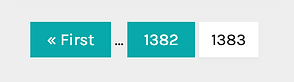
The 'Highlighted' section shows the campaigns selected for their excellence by website staff. This is one of my favorite sites to go to when searching and learning creative ideas. The real problem is that in this "Highlighted" site, there are 82,920 items and 1,383 pages, without categories, navigation, or filter from the beginning.


A huge number of items
2
EPLANATION
IDENTIFY USABILITY ISSUE
The “Highlighted” section of AOTW violates several key usability principles, interrupting user experience.
First, the 80/20 rule is disregarded, the essential 20% - effective navigational tools like filters, categories, or local navigation - are absent. Instead of helping users quickly access relevant content, the site lets them spend more time clicking through pages, wasting time and reducing efficiency.
Effective navigation is also missing. The missing of filters, categories, or sorting options makes navigation difficult and time-consuming, frustrating users. The site also does not provide breadcrumbs, a navigation bar that provides links back to each previous page a user navigated to get to the current page. This issue decreases the user experience because it violates basic navigation principles.
Additionally, progressive disclosure is overlooked. In the “Highlighted” site, even other sites, all content is presented at once, with no option to filter or gradually refine what you see. This violates the idea of scanning overview information based on user needs, preventing users from narrowing down their search scope step by step.
Finally, the absence of visual hierarchy further complicates navigation. Here, there is no clear distinction between high-priority content and less relevant items. All items as I observe are designed equally (as below images), without using visual elements such as size, position, or hashtag to guide users to the most important or latest content. The unclear hierarchy makes it difficult for users to determine the most relevant content.

This site does not look like its name - “Highlighted” – and breaks multiple usability principles by failing to offer essential navigation tools. An efficient local navigation and better visual design would drastically improve the user experience.
3
CONCLUSION
Design Solution
As analyzed above, a local navigation for the "Highlighted" section is important. Therefore, I propose designing a new category list that narrows directly from the "Highlighted" section. This pop-up list will include four categories: type of advertisement, industry, region, and a collection of highlighted content.
From global navigation...

...I suggest there is a dropdown menu for user easier to scan.

With a breadcrumb on top
These solution improves site navigation by providing users with clearer paths to explore content. Adding local navigation and breadcrumb allows users to easily track where they are in the “Highlighted” section, reducing confusion and allowing for smooth transitions between sections or backtracking as needed.
The new category list, which includes filters for ad type, industry, region, and highlighted collections, simplifies content discovery by allowing users to narrow their search based on interests. This targeted approach not only saves time by helping users quickly find relevant ads, but also creates a more intuitive and organized browsing experience. Finally, these improvements result in a more streamlined and user-friendly site that encourages greater engagement and reduces frustration.